When building a web on my own I generally face two challenges: what to put in it and how to put it. Usually the urge of getting the job done pushes me to start developing after visualizing the global picture, and I don't spend enough time trying to solve those challenges properly. As a consequence of this haste, I sometimes feel my web sites are lacking something... but what exactly? Here are the bad decisions I made while developing my old website and how I approached them on this new version of my web page.
Web format
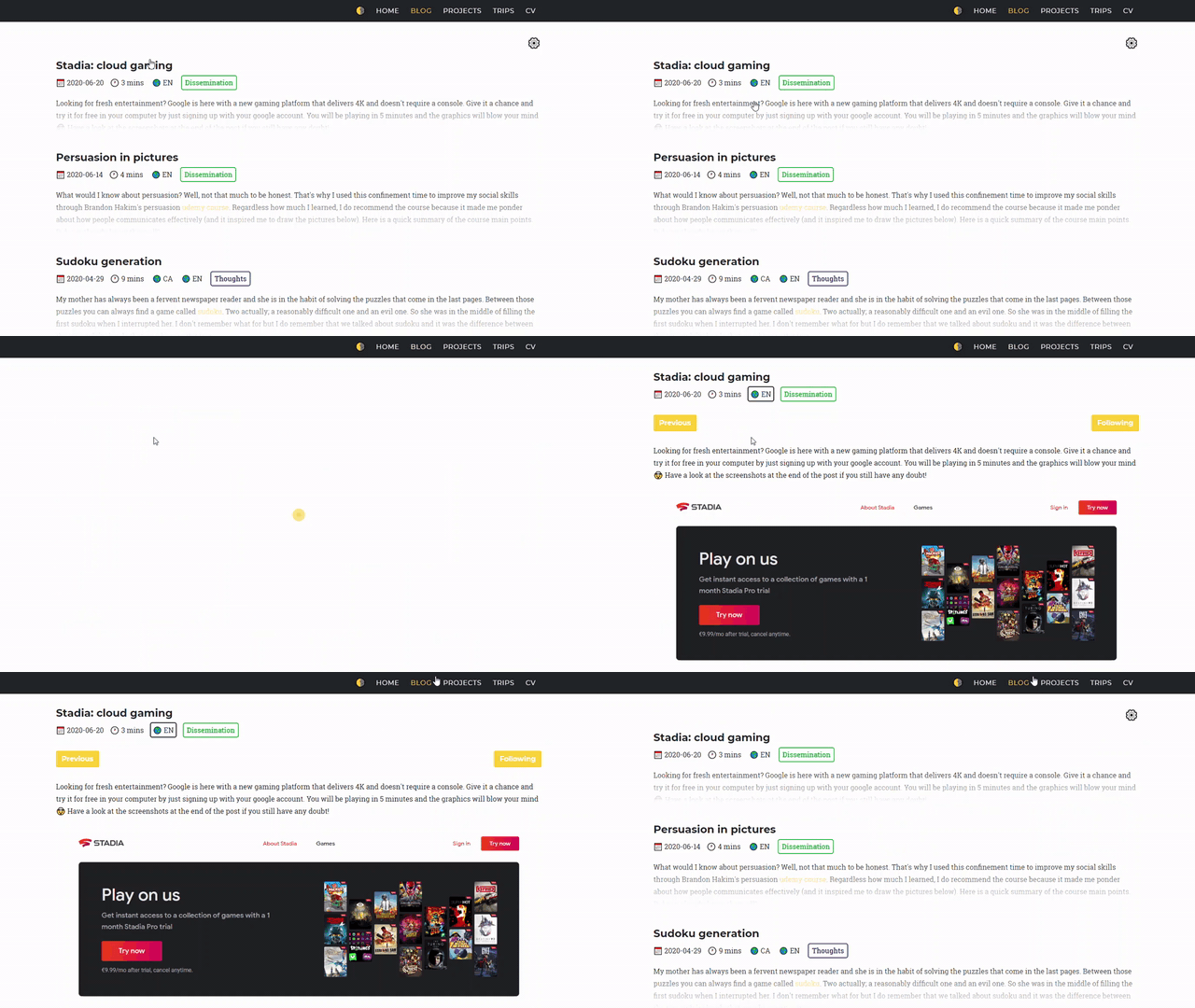
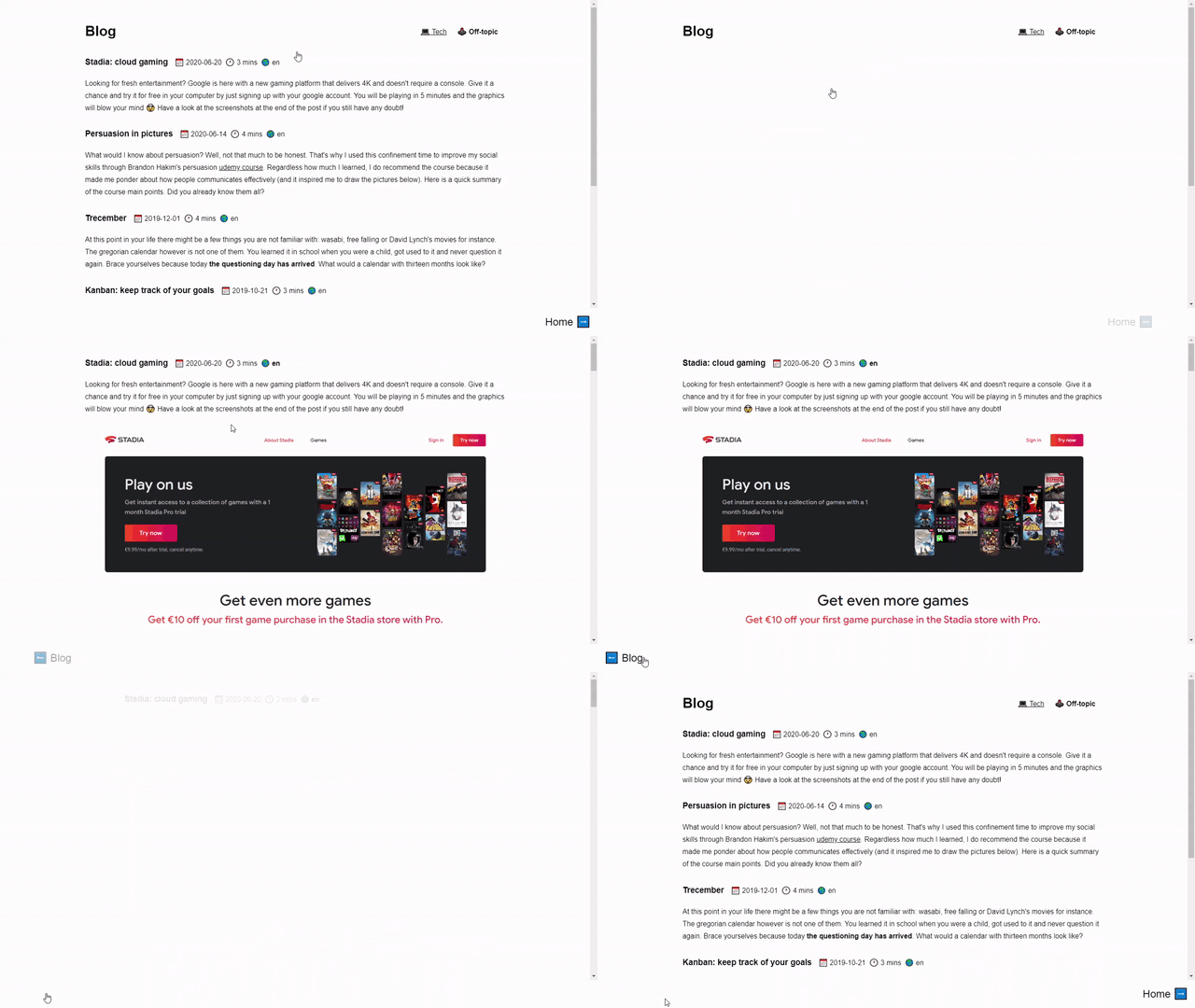
I created my web page because I wanted to have a stronger online presence. Given that web was about to become the official public online version of me, I built it as a descriptive website, a formal presentation on how I'd like to be introduced. It was more or less aesthetic, but it was designed for the general public; it provided information in a reasonably nice user interface.
My audience are not recruiters or fans though. No one visits my website to check out my CV neither to see the list of places I've travelled to. When it comes to building software, the main point is always the same. Who are the users of the app? My audience are friends, family and co-workers: they visit my website out of curiosity. Is not the information they can find there but the user experience that they will remember.
Having understood what my visitors expect to find in my website I designed this new version of the page to have less information and to be more enjoyable; although there are no page loads between sections navigation, I still animated the transitions.
Information indigestion
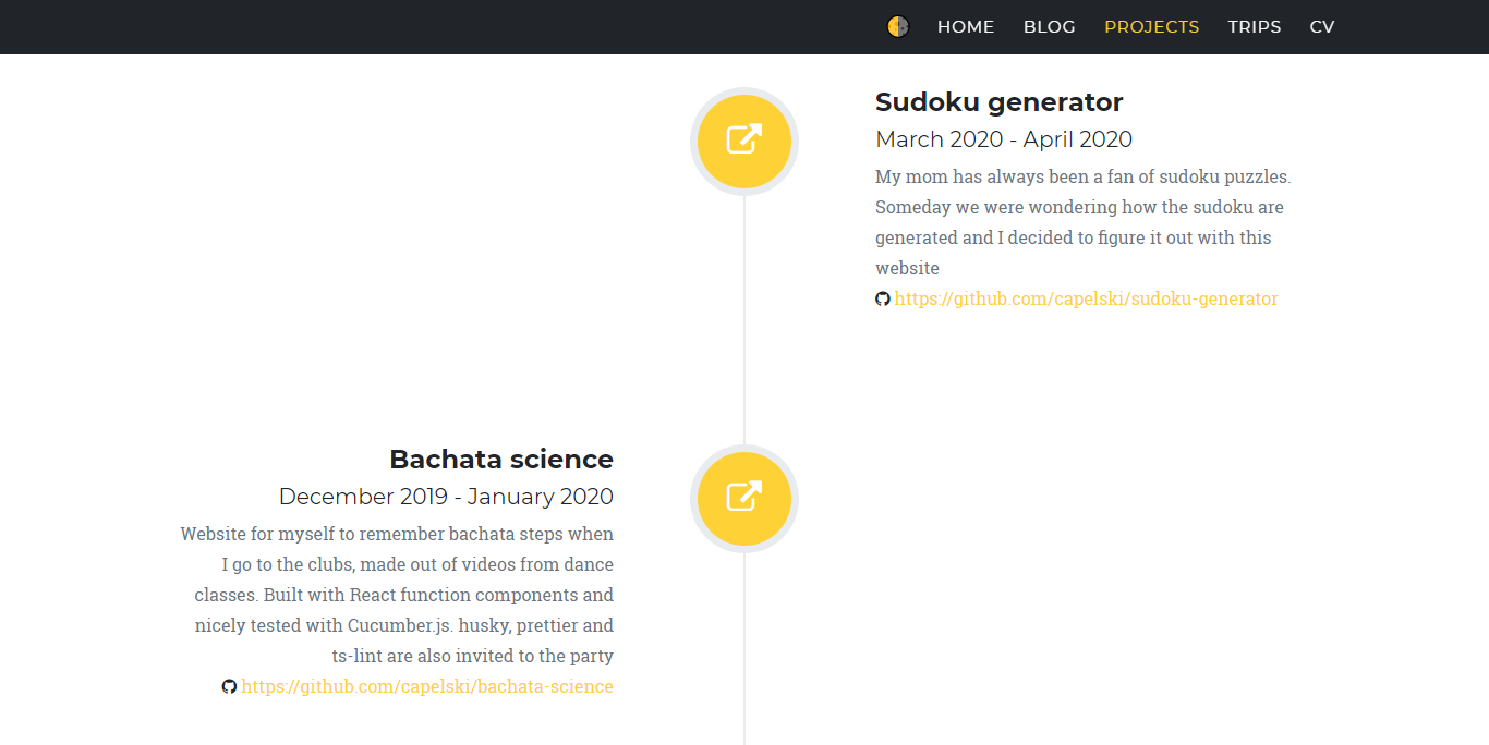
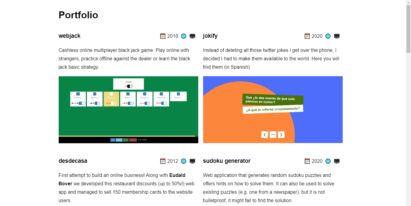
I am proud of the websites I've developed and I could spend hours talking about why I built them and how I did it. There is a purpose behind each of them and I lived the whole ideation and development history. The visitors of my web don't share this enthusiasm though. Not only they don't know about the projects' context; they are not even aware about their existence. Why would they waste their time reading about something they can't relate to?
In my old website I tackled this issue by adding a link to the actual websites, so visitors could access them. I later learned this is too much to ask for; visitors need a preview of what they will find there in order to click the links. I did keep the links in the new version of the page, but I also added an image of each website and I cut down the descriptions.
Perfectionism
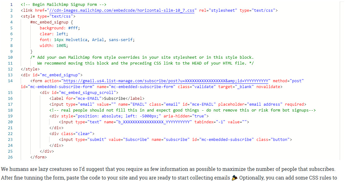
Being a software developer makes me want to write about code on my blog and sometimes I like to provide code snippets to help illustrating concepts. The most popular solution when it comes to displaying code snippets on a website are pastebin services (i.e. medium uses Gist, the Github pastebin service).
Gist code snippets have a minor drawback however; they are meant to be inserted during page loads. Given my website doesn't reload the page when navigating across sections, the code snippets fail to calculate the appropriate height. It's not a critical issue because the snippets will have a scrollbar to move the content, but when I was building my old website I wanted the snippets to have the proper height.
Instead of abiding the pastebin solution, I chose to integrate Monaco editor to my page, a text editor with a bunch of features specially designed for coding. Because it's written in JavaScript, it can be easily integrated in a web page, resulting in nicely colored code snippets. It's not only more customizable but it gives code snippets the proper height 🤩
While I think it's admirable not to settle with the standard solution and go for higher standards, I must admit that in this case I went too far. Monaco editor is a complex library; it's meant to write code, not to display code snippets. It can be used for that purpose but it heavily increases the website load time for very little gain. In the new version of the website I lowered my perfectionist demands, accepted the Gist limitations and achieved a similar solution to the problem while keeping the web light.

Worsening features
After having written a number of blog posts I thought it would be cool to have a calendar view of the blog entries, so I could check how often I was posting on my blog. I quickly found a compatible library, managed to display a calendar highlighting the dates in which I posted to the blog and rearranged the blog layout to include the calendar view. Because the calendar took too much space to always be visible, I created a collapsible section, moved the blog filters in it and proudly deployed my latest feature.
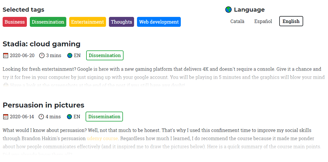
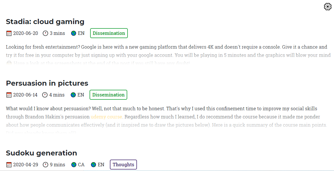
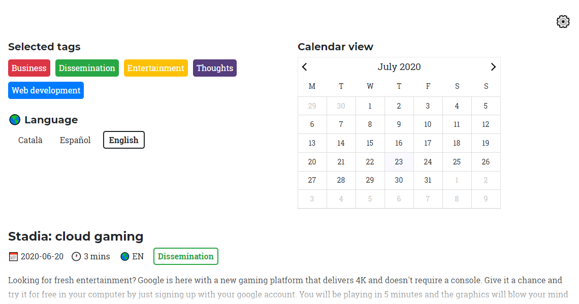
What I unfortunately ended up doing though was making the blog page less intuitive, as I made the blog filters less accessible while adding little value with the calendar view itself 😔 Yes, I could have solved this issues by changing the way to access the calendar view while keeping the blog filters always visible. My point here is that sometimes it's better not to have a feature than to force the web to accommodate it. In my new web page I decided to omit the calendar view, both for better filters access and because I felt it wasn't worth spending time on integrating it given the minor improvement it adds to the web.
Opinionated categories
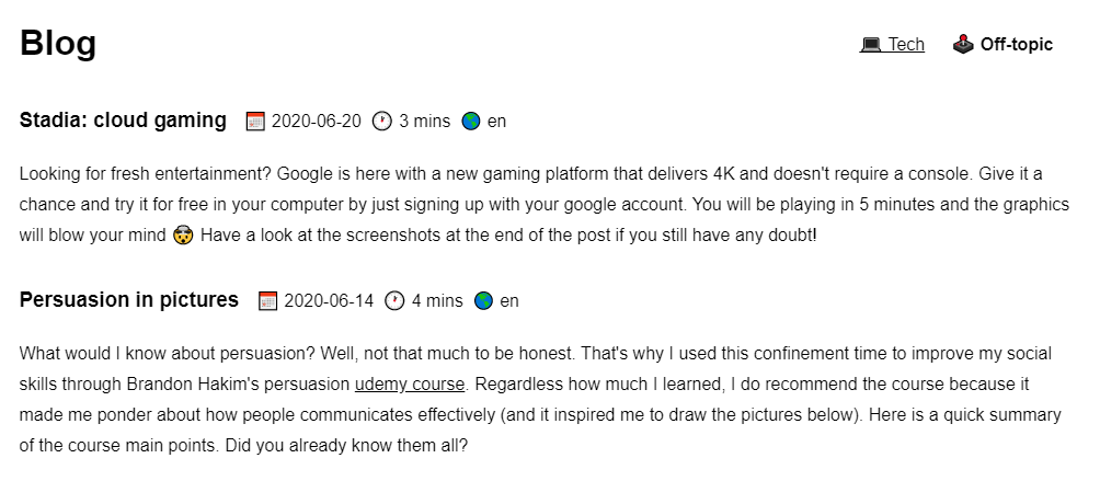
I enjoying writing my blog because I write about any topic I feel like writing in a given moment. As a result the blog is a mix of entries; from articles on the meaning of life to technical descriptions on how to turn your website into a progressive web app. Knowing those topics are too diverse to target a single audience I decided to segment the blog into different categories, so web visitors could filter the blog entries based on their interests.
The segmentation system I came up with was simple: labels. Each of the blog entries has a category label and visitors of the blog can select the labels they want to read about. So far so good. What I missed in this approach was defining upfront standard labels that could be easily understood by the visitors of the site: not everyone will expect to find the same thing in a category named 'Dissemination'.
In the new version of the page I solved this issue by reducing the number of categories to two. It's a less refined system but it's easier to understand. Hopefully, it will also force me to select more relevant topics in future blog entries 🤞

Conclusions
Did I really need to make a new version of the page to fix the issues I mentioned? Probably not. But don't forget that I'm a developer! We take every opportunity we can to rebuild a project from scratch using a whole different bunch of technologies (in this case I was tired of Vue.js and I wanted to play around with React transitions and add type safety to the equation).
It's your turn now! Can you identify any of the issues above in your web page? It can be hard to understand that this awesome website you are so proud of is being perceived in a different manner by your visitors. Best test? Watch your mother browsing the page without explaining her how it works. See you in the next post!